When a major new commercial building project is proposed in Sonoma, its appearance is scrutinized, poked, prodded, and otherwise worked-over by committees until it is declared suitably “Sonoma-Style”. Thus we see “Sonoma-Style Farmhouse” and “Sonoma-Style Barn” popping up in proposal project narratives reading more like real estate sales brochures than project applications.
This predictably raises the predictable question: What is Sonoma-Style? Luckily, it’s a question that can be answered easily: There is no such thing as Sonoma-Style.
I suppose, if one goes back far enough in time, we might get closer to a finding a “style.” Considering our oldest, major structures, I’d call Sonoma’s Style “Colonial-Adobe.” Think Barracks and Mission; exposed, rough-hewn beams, thick mud walls plastered white, gravel courtyards – that sort of thing. Buildings with low overhangs for shade and second story porches, small windows, tile roofs; our old adobe homes are still around providing examples.
Today however, Sonoma-Style has nothing to do with appearance and everything to do with being non-controversial. It’s commercial architecture intended to recede into the background and not attract undue attention; it’s new but it doesn’t really look new; it reminds us of something, but exactly what is hard to say. Mostly, it looks…ok.
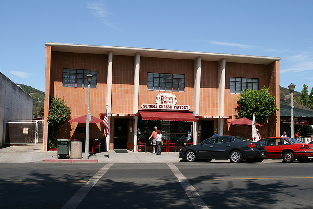
Ironically, over time public spaces have a way of transcending what we might find, even today, oddly out-of-place. Take the Sonoma Cheese Factory building on Spain Street, for example (photo above). That building’s “Non-Sonoma-Style” design would never make it through our current approval process, and yet, having lived with it for nearly thirty years, I’ve become fond of it. Perhaps I’m even late to the game, and others find that retro-quirky, “modern” design endearing.
The Sonoma Cheese Factory works because the context in which it sits has not changed: the Barracks to its left and older buildings to its right. Time has softened its impression, and its earthy tile color, in retrospect, is conservative. Oddly enough, today the Cheese Factory looks refreshingly creative; it’s not derivative or ersatz-anything, and certainly not Sonoma-Style. Twenty years from now it will appear positively quaint and authentically Mid-20th-Century.
In its attempt to “fit in”, Sonoma-Style has imposed itself as the new standard, which in common parlance means a building design likely to be approved by committee. In the process, creativity and design innovation have been discouraged, to the point that innovation and bold design in public buildings are not really viable options. Sonoma may be famous for its wine and cheese but it won’t be famous in the future for its striking new architecture.
I”m not advocating for Gleaming Glass Cubes, but I’d love to see some examples of innovation. Our town need not be stuck in a time warp repeatedly replicating what we imagine we are supposed to be. Instead, we should be prepared to envision and participate fully in the future, one where materials, environmental impacts and cultural effects look sharply forward, not back. We can unleash the creativity of those who study how people interact with public spaces and built structures, if only to get a sense of what we might be missing. It seems strange to enter the 21st century with new commercial buildings with designs derived from the 19th. Surprise, surprise, if we take a chance we might like what we see.
Interestingly, there is far more architectural innovation and creativity displayed in the creation of some new private homes and their creative use of new materials, contemporary style and striking design than new commercial buildings. There’s a message there.
Sonoma-Style is safe, but it doesn’t send a strong signal other than “playin’ it safe.” The condition of society, the planet and the environment, however, are well past “playin’ it safe,” and responding to current and future conditions requires strong and creative solutions. I don’t know exactly how those sort of solutions might look, but I’m curious.


Be First to Comment